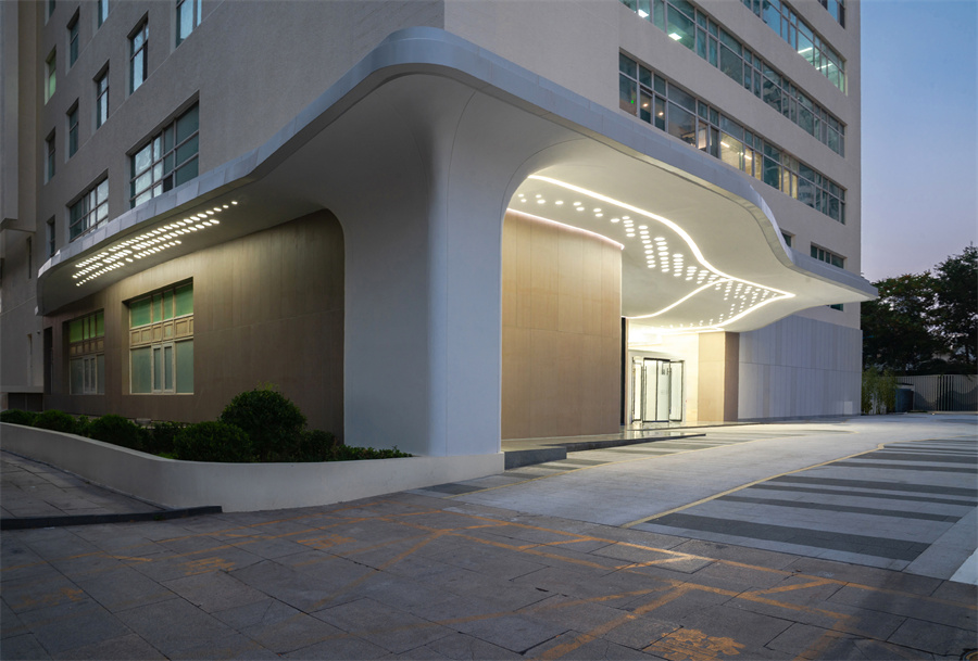
雨棚形态如同从已有建筑中溢出的“云彩” ©刘敏玲
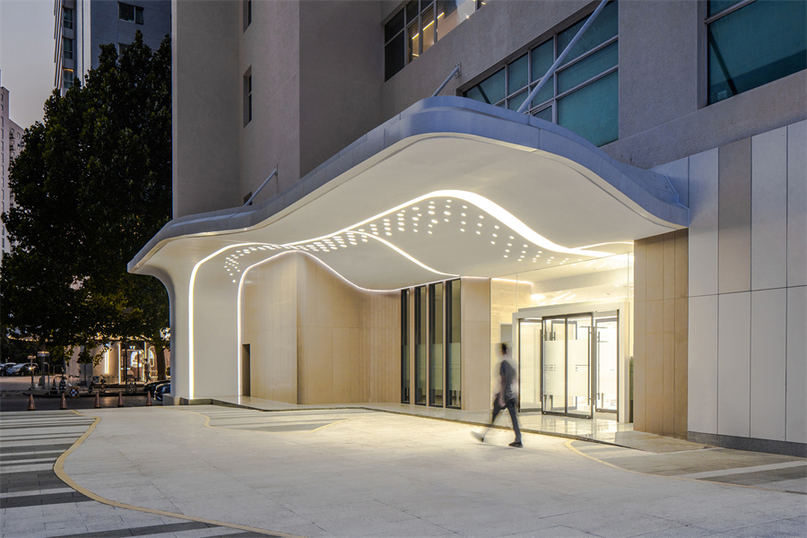
雨棚与灯阵形象展示 ©刘敏玲
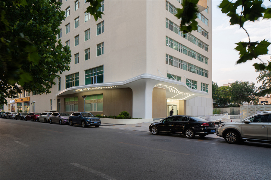
雨棚在城市街道的形象展示 ©刘敏玲
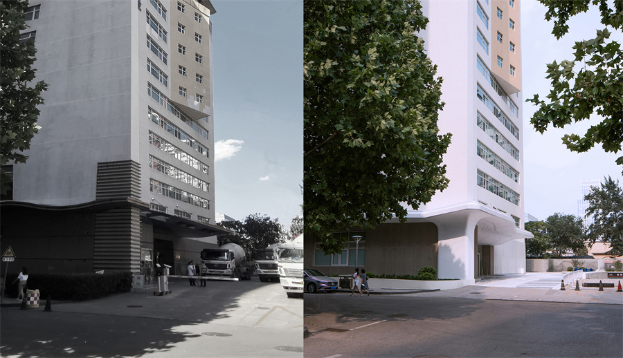
雨棚改造前后对比 ©甲方提供、刘敏玲
原貌: 零散、缺乏识别性
Before: Fragmented, Lack of Identity
项目所在的办公楼的建成年份大概在20世纪90年代末期。项目改造内容主要分两部分,室外的雨棚以及一层的入口大厅。室外的雨棚部分处在市中心核心区域的关键十字路口,其沿街面可以从区域内各个方向进行观察。改造的任务主要面临三个问题和挑战:
The project is located in an office building that was constructed in the late 90s. The exterior canopy part is situated on a conspicuous location right next to a cross-road which is well-known within the local area. Renovation task and challenges we met including the following:
首先,雨棚和室内大厅的装饰风格较为陈旧,不符合高新技术的企业定位。客户希望以“星辰大海”为主题进行改造,去体现企业自身以科技创新为主导的精神。
The rustic appearance of the original canopy and lobby does not meet the visual quality required by the client. The Client wish to imply the idea of “Star & Galaxy” in order to reflect the technological and creative ethos of the firm.

雨棚轮廓新旧对比 ©甲方提供、刘敏玲
![]()
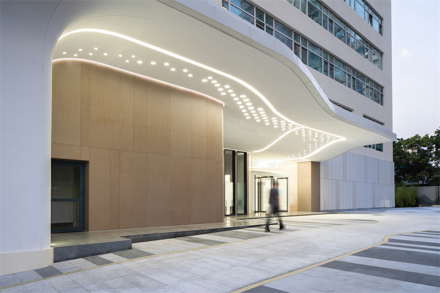
雨棚灯光引导人流进入办公大厅 ©刘敏玲
其次,室内原有格局的局限性较多包括:
(1)平面布局过分“明确”,过道即走廊,使用空间即房间;
(2)前台,电梯厅等都存在过分固化的区域划分;
(3)现有结构层高偏低柱网太密,导致整体空间局促以及大厅中央区域出现四根较大的基柱,影响设计的可发挥空间和改造的自由度。
Due to the original structural configuration of the existing building, there are quite a few constrains. Existing column grid is very dense, four thick and dense base column situated right in the centre of the lobby will have negative impact on both visual appearance and plan layout.
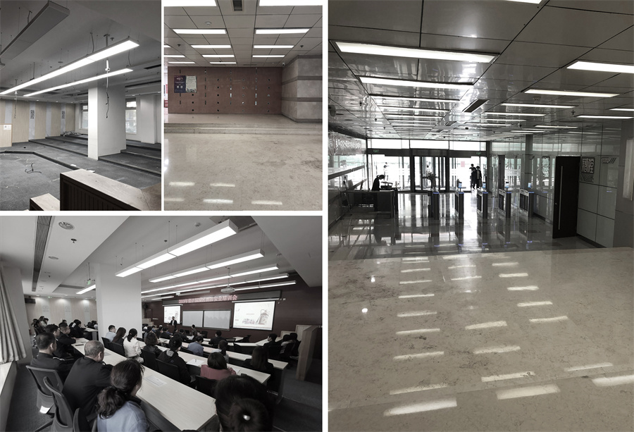
项目室内原貌 ©甲方提供
最后,项目室内室外的装饰元素太零散,彼此缺乏整体协调和呼应。加上处在街道的十字路口,因此在街道外的各类标识以及设备机箱等元素加剧了整个空间视觉导向混乱,造成整栋大楼的标志性缺失。
The interior and exterior part of the project lack connection and unity. To make matter worse is that there are many scattered elements such as signs and mechanical installations on the street, had made the appearance of this area even more chaotic, hence the lack of identity.
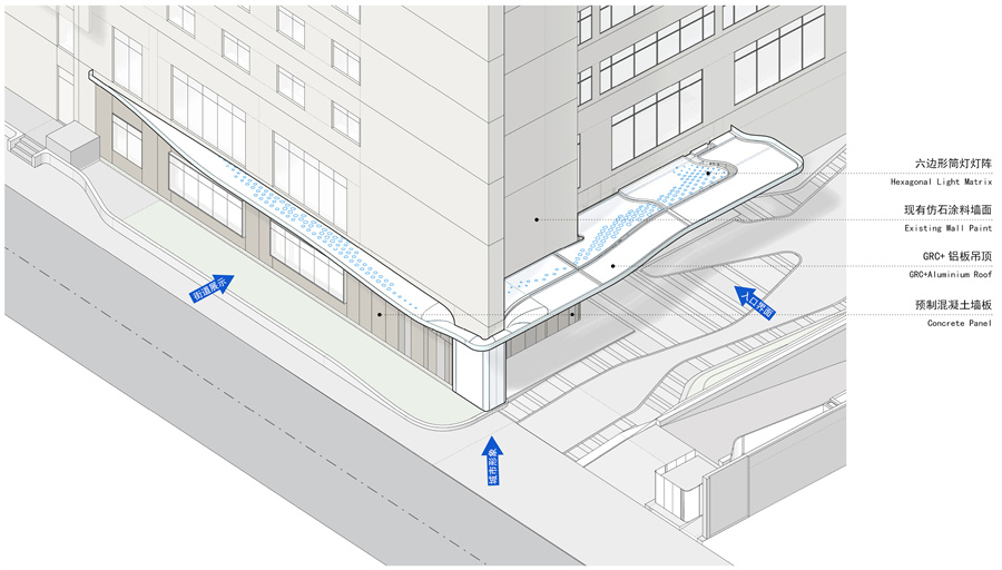
雨棚与界面分析轴测图 ©中天建中
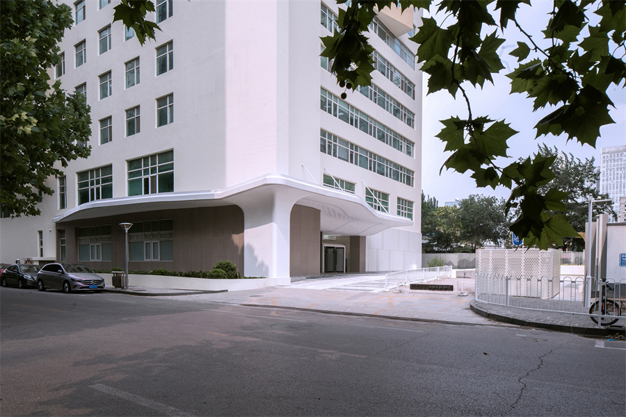
雨棚沿街界面展示 ©刘敏玲
愿景:集成、激活
Vision: Integrate & Activation
面对上述问题与挑战,设计希望将办公大厅的功能从原来纯粹的接待与通过式空间转变成更加混合和多元化的载体。同时,利用客户提出的主题 ——“星辰大海”作为灵感来源,将这个虚构的概念通过意向的提取,转译并最终以建筑实体的形式予以实现,打造契合客户高新技术企业形象的创新空间。
Due to above-mentioned issues, our design seek to transform the very nature of this lobby, from pure reception and transient space to a multi-functional hub that will contain a variety of merging programmes. In the same time, the design will derive inspiration from the abstract concept of “Star and Ocean” and had realized it into tangible architectural form.
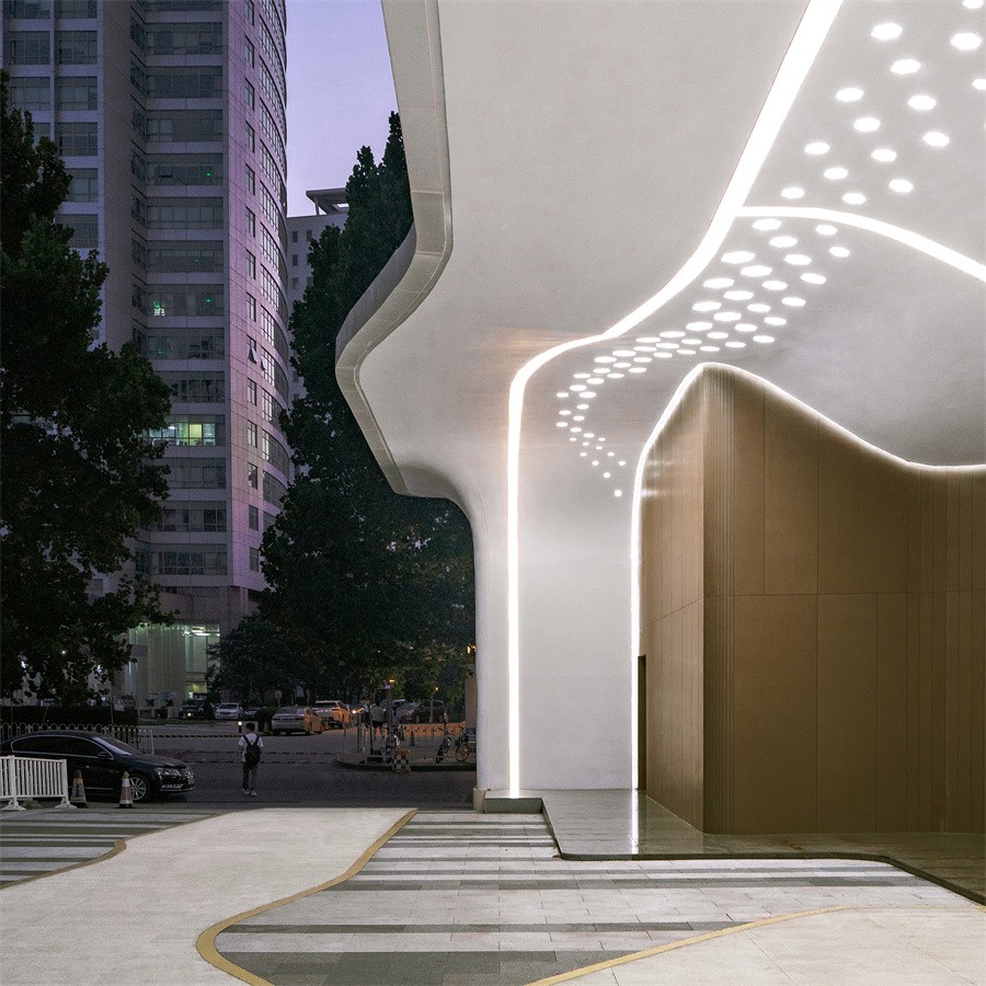
雨棚的形态与城市夜景 ©刘敏玲
设计意在打造一个具有科技氛围的集成空间(Fusion Space),包含交流互动、展示、休闲、洽谈以及接待等功能。同时布局将挑战传统空间的确定性划分,营造流动且通达的空间体验。用具有科幻感的设计语言贯穿项目的室内空间,延展至室外使其形成一种标志性,让陈旧的办公楼以及周边街道焕发出新的活力。
Our design seeks to create a fusion space that will include programmes such as interaction, exhibition, leisure and reception space. In addition, it will challenge the conventional understanding of division and boundaries, through creating fluid connection between different sectors within the space. Finally, unique design language with futuristic essence will extend into the exterior of the building, and revitalize the local area through its visual identity.
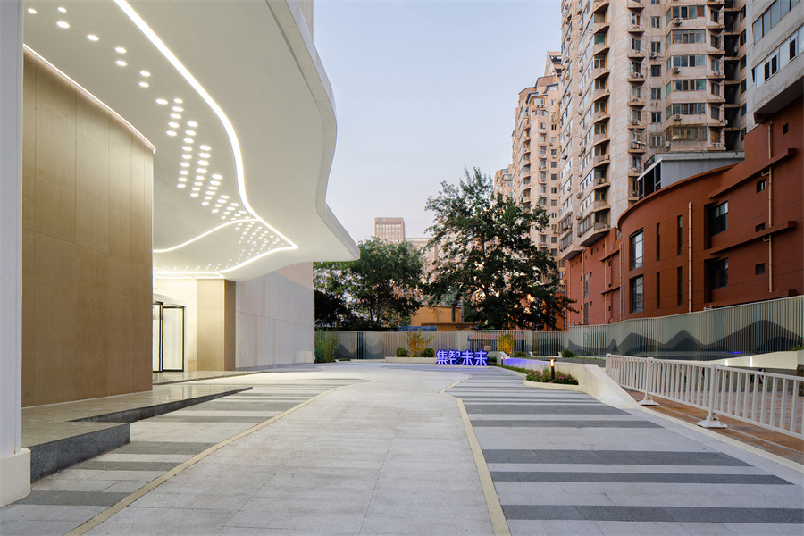
项目更新部分与周边街区的新旧对比 ©刘敏玲
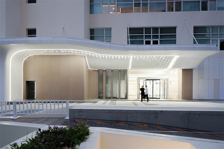
项目室内外空间的相互延伸 ©刘敏玲
过程与挑战
Development & Challenges
大楼现有的结构系统为设计带来的布局限制主要有三点。
There are three main limitation caused by the existing structural system:
1. 中间的大立柱形成了视线的阻隔,在视觉层面使人感觉空间被自然分割为好几个部分,很难对大厅空间形成一个完整的印象。
Columns situated in the central part of the lobby had form visual barrier that prevent viewer to gain proper impression of the overall space, as if the lobby space is segregated into few parts.
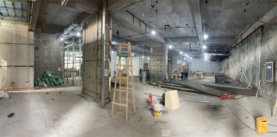
项目室内结构轴网形成视线阻挡 ©中天建中
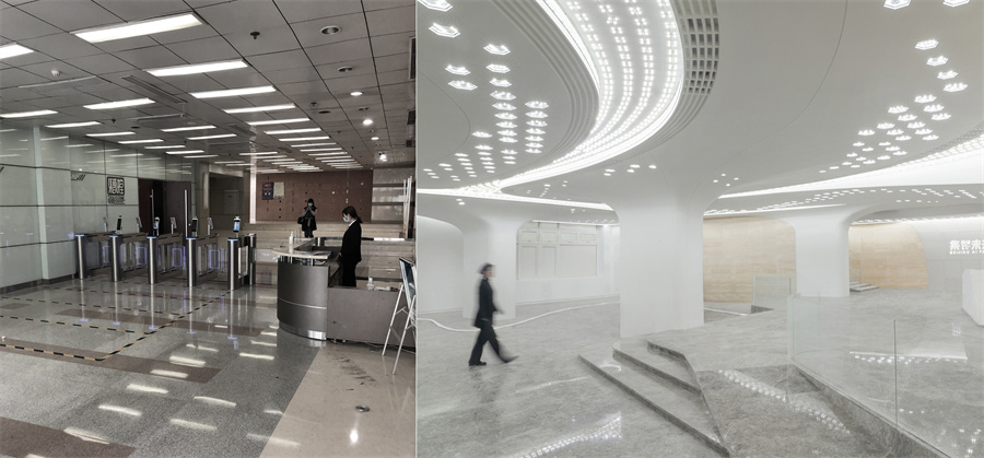
项目室内前台区域改造前后对比 ©甲方提供、刘敏玲
2. 柱网和承重墙导致原有的室内流线不顺畅,由于承重墙的遮挡从大厅主空间进入的大量人流无法从正面进入电梯厅,而需要绕道从侧面进入,空间体验缺乏应有的序列和层次感。
Orientation of the original lobby is rather peculiar due to the configuration of existing column and shear force wall, visitor circulation had to do an abrupt turn and enter the lift lobby from a very strange direction. Thus lack the sequence and spatial hierachy for visitor to navigate through the lobby.
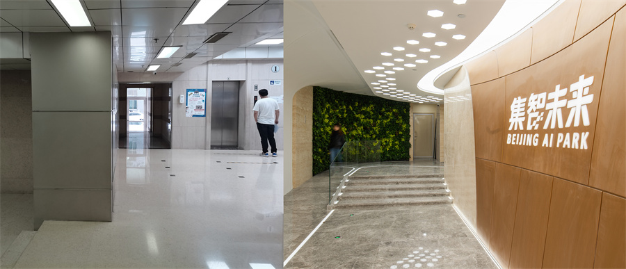
项目室内电梯厅前厅改造前后对比 ©中天建中、刘敏玲
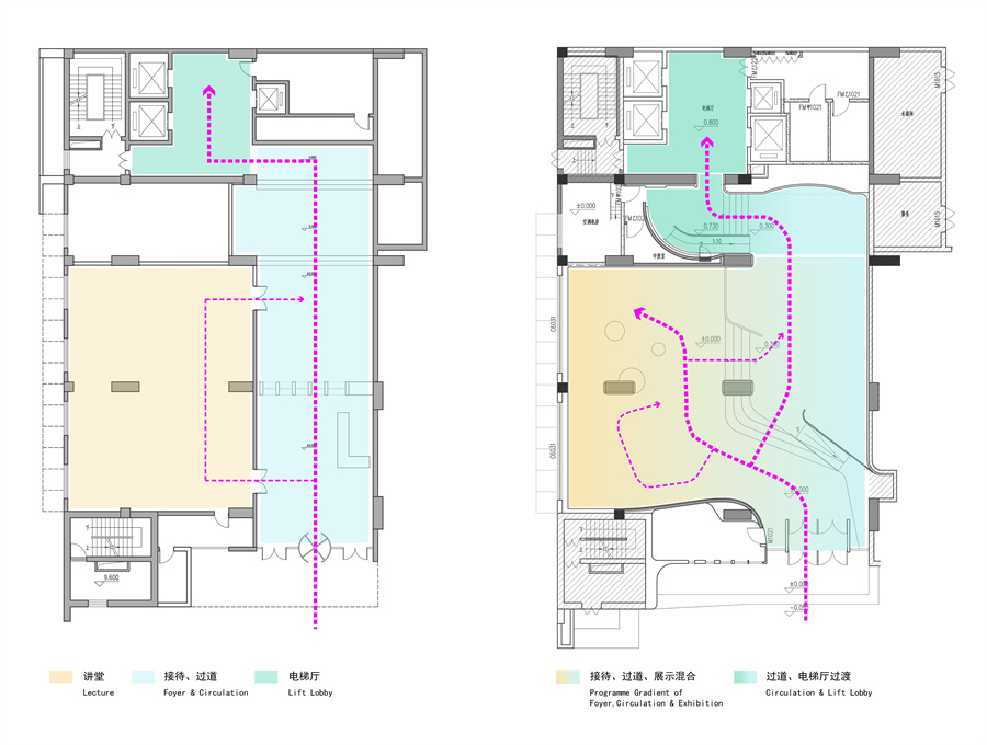
改造前后大厅流线及功能布局对比 ©中天建中
3. 现状另一个棘手的约束条件是室内净高与室外高度差较大。室外雨棚的结构高度则在4.9米的位置。从室外看,由于雨棚和办公楼整体的比例控制,以及为了保证雨棚在街道的视觉效果,因此雨棚的高度不能改动。同时由于吊顶中大量的现有排烟管和消防管,室内的净高在极限条件下只能做到3.3米。这些因素导致原有雨棚与大厅空间不连贯,同时也为设计意图达到的室内外延伸效果带来很大的挑战。设计需要通过合理的形体手段,消解室外雨棚和室内大厅吊顶之间存在的剧烈高差。
Another major limitation is the difference in height between inside and outside. Originally the canopy structure was suspended at a height of 4.9m. This is because of a proportion control with the overall building, as well as it needs a certain distance away from the ground to gain visual attention from the streets. On the other hand, due to many already operating pipes in the ceiling, the interior clearance can only reach 3.3m at the most. This dis-junction between inner and outer had caused much difficulties for the design to bridge the design quality of the lobby and canopy, as the architectural form has to deal with the significant height difference between in and out.
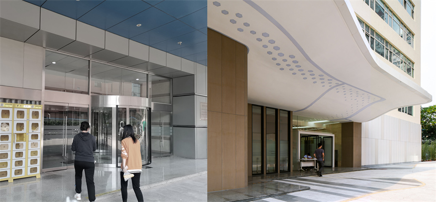
雨棚与室内高差改造前后对比 ©中天建中、刘敏玲
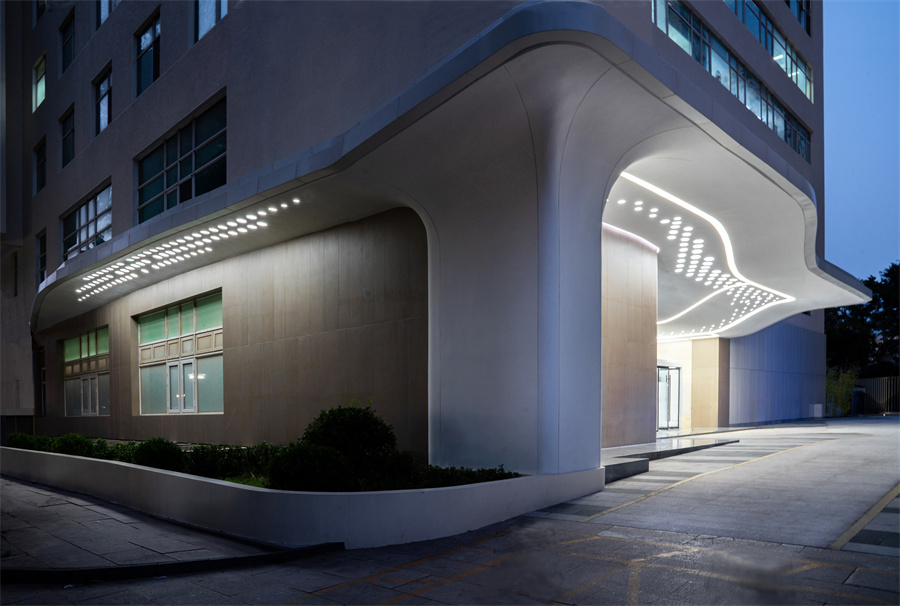
雨棚轮廓与灯阵的呼应关系 ©刘敏玲
形态融合
Integration of Form
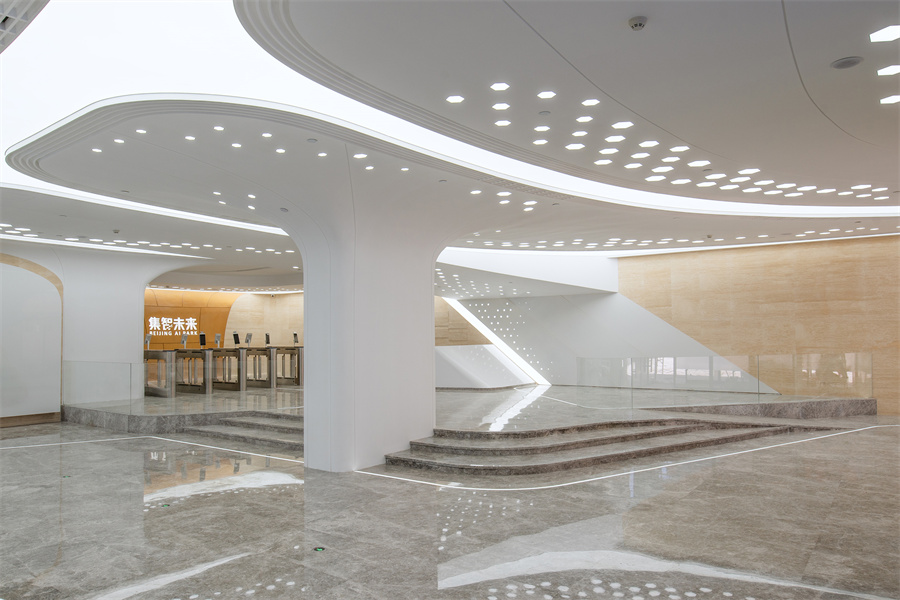
以天空中“云”的形态为启发,设计通过流畅的弧形语言来实现室内柱、墙和吊顶等元素的相互延伸,将原本零碎的建构元素整合成一个一体化的系统,宛如一个完整的“智能界面”。
Using the shape of cloud as a source of inspiration, columns, walls and ceiling will infiltrate and extend into each other through the use of arches and curves. so tectonic elements that would conventionally be segregated would be systematically organized and blended into one unity, like an interactive interface.
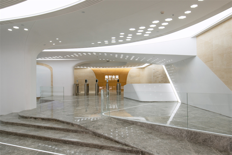
室内大厅正面 ©刘敏玲
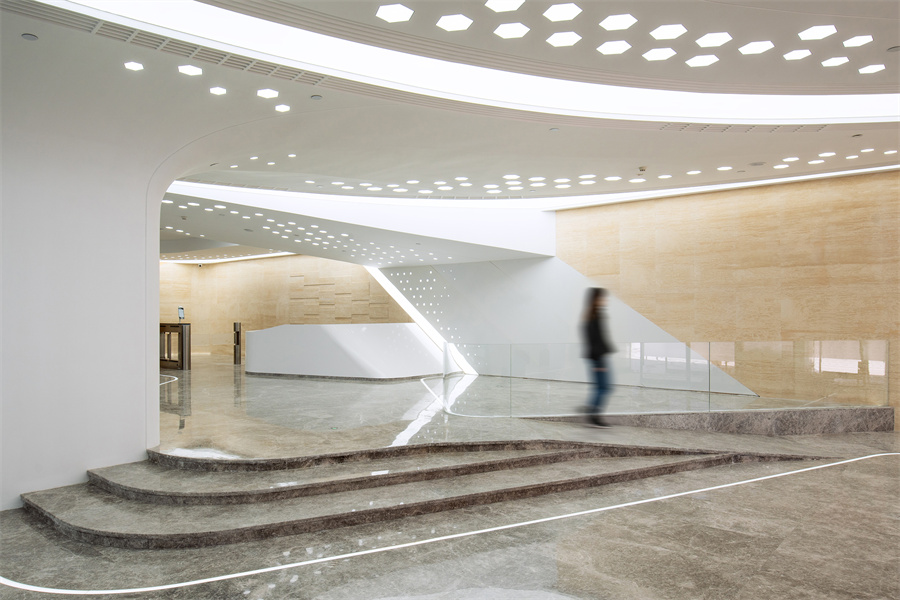
室内前厅局部 ©刘敏玲
![]()
室内柱体与吊顶的延伸关系 ©刘敏玲
功能融合
Integration of Programme
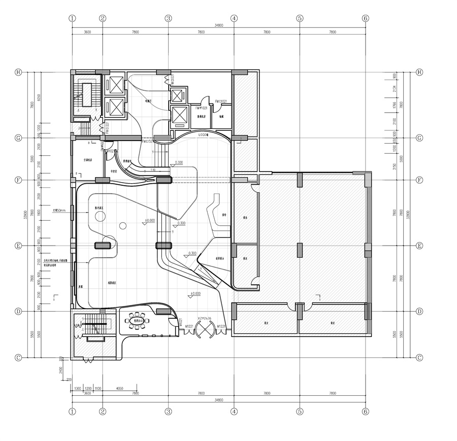
设计将原有的学术报告厅去除的同时增添了展示空间和小型办公室。新的设计并没有固化地将大厅内的各类功能进行物理分割。而是通过地面材质的划分以及灯带等元素,形成了流动的空间(Circulation Space)和停留式的空间(Habitation Space)之间的“非确定边界”(Indefinite Threshold)。小型办公室和维护间等辅助功能布置在外围,大厅的接待,过道和展示功能则是通过这些“非确定边界”有序地融合成一个整体。在不同的时间段,可以根据不同事件和场景使用需求相互延伸。
The brief require us to remove the original lecture hall situated on the west side and add small offices and exhibition space. New design will not separate these different programme with physical barriers but integrate them into acontinuous interface. Subordinate functions will be placed on the outer perimeter, and indefinite threshold between circulation and habitation space will be formed through the use of different flooring material and light strips. Thus exhibition, reception and circulation may be integrate into a systematic whole, and different functions may blend and merge into each other according to various use and event.
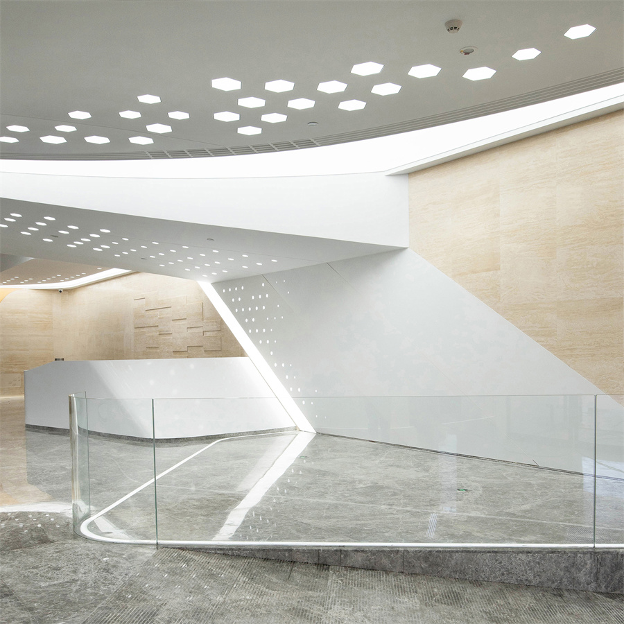
地面灯带及护栏形成“非确定边界” ©刘敏玲
![]()
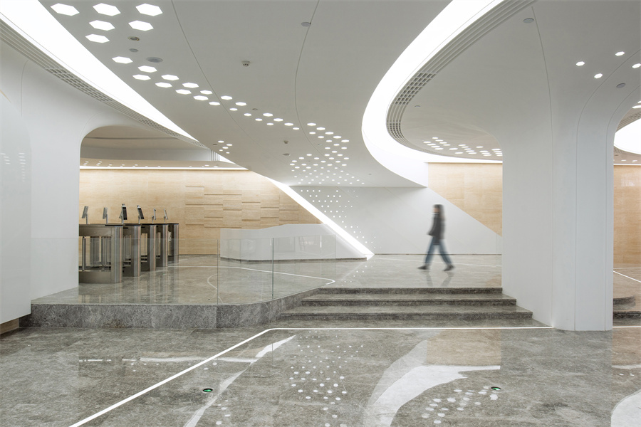
室内灯光与吊顶流线的呼应 ©刘敏玲
动线融合
Integration of Movement
设计置入了一套参数化灯阵去回应设计任务书提出的主题“星辰大海”。灯阵由四种不同尺寸的LED六边形灯组成,尺寸分别为250㎜、200㎜、150㎜、100㎜,其布局方式根据功能和亮度的需求,设置灯阵的密度和筒灯的尺寸,在满足照度和营造科幻氛围的同时,形成遨游聚合的态势,并对人群的活动进行引导。随着灯阵的流动,依次经过门头、集散区、展厅和前台、Logo墙区、过渡区以及电梯厅等空间。每一个空间都会根据灯阵、曲面轮廓和材质的关系变化,为使用者带来独特的场景体验。
A parametric designed “lighting matrix” are implemented as a reflection to the idea of “star and ocean” raised by the client. The matrix is aggregated by a large number of hexagonal lights that varies in four different sizes with the dimensions of 250㎜,200㎜,150㎜,100㎜. The positioning of these lights is based on the intensity of activities and functional requirements of different areas within the lobby. However in the meantime this way of positioning would also generate a sense flow that will guide, converge and influence the pedestrian circulation. What’s more, is that this design feature in its singular hexagonal shape will be read an unifying icon that forms the linkage between different areas such as reception and exhibition, but collectively it will then become a shape-shifting element which will enrich the visitor’s spatial experience as they move across the lobby.
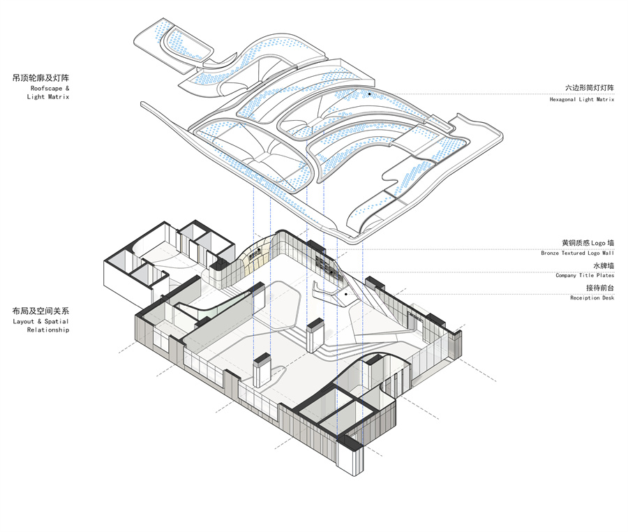
室内大厅轴测图 ©中天建中
![]()
室内大厅平面图 ©中天建中
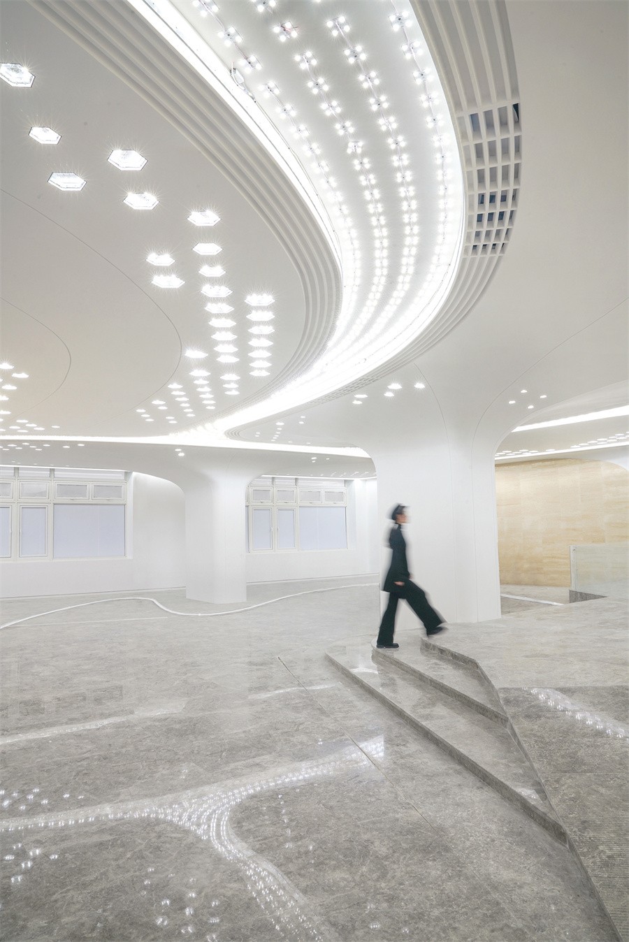
室内灯光态势形成对流线的引导 ©刘敏玲
具有动感的曲面元素,与灯阵结合遥相呼应,光影与弧线轮廓相互映衬,形成如电影场景一般的科幻场景。随着光线的进退和材料质感因光线不断变化,使用者每天上下班都可以在这个互动的空间里,根据不同的时间段去体验光影变化带来的诗意。
Dynamic curved features, resonating with special lighting effect created by the light matrix, as a result of their combined reaction has created cinematic scene very much like science fiction. During various time of the day, the dynamic profile of the space will be rendered differently, and visitors will thus gain an ever-changing experience as they journey through the lobby in their daily routine.
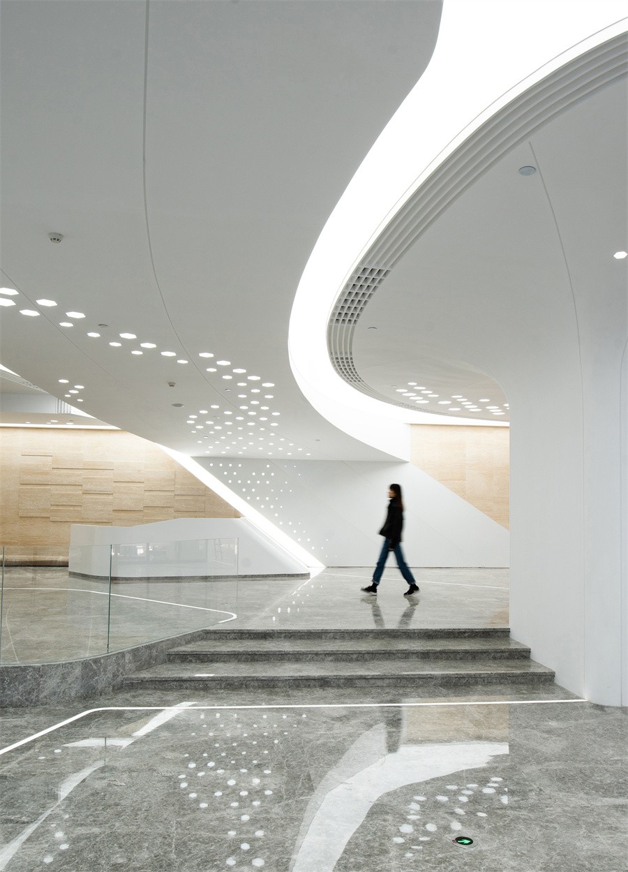
弧光轮廓营造科幻氛围 ©刘敏玲
材质融合
Integration of Material
常规建筑设计中,设计都意图强化不同材质的特性,比如石材和混凝土就应该表现出厚重感,金属是轻盈而玻璃则是通透。本项目中,设计师则是希望弱化这种材质上的差异性,体现材料的非物质化(Immateriality)。目的一是强化科幻现实的体验,二是希望体现当今高新科技产品不断追求的简洁和一体感。设计在技术上探索了材质的可塑性边界,用同一套曲面形式语言去控制不同属性的材料,将GRG(Glass Fibre Reinforced Gypsum纤维增强石膏)、 GRC(Glass Fibre Reinforced Concrete纤维增强混凝土)、石材、铝板、人造石等具有不同物质属性的材料都归纳整合进一个浑然一体的建构系统中,通过材质与造型的融合,呼应“集成、激活”的设计愿景。
Conventional design method often seek to emphasize the difference in nature between material types, such as the bulkiness of concrete, porosity of glass and the light-weight essence created by the texture of aluminium. In this project, our design had approached the discussion from a different perspective and the design process had allow us to explore the limits of, as well as the possible interactive relationship between different materials. As a result of our study, we managed to achieve something that reverse the logic of the conventional material setup, which is, despite the differences between various material such as GRG(Glass Fibre Reinforced Gypsum), marble, aluminium and artificial stone, they will be integrate into one unifying system, through the use of consistent formal language. As a result, the integration of material and form will reflect the key concept of “ Integrate and Activation.”
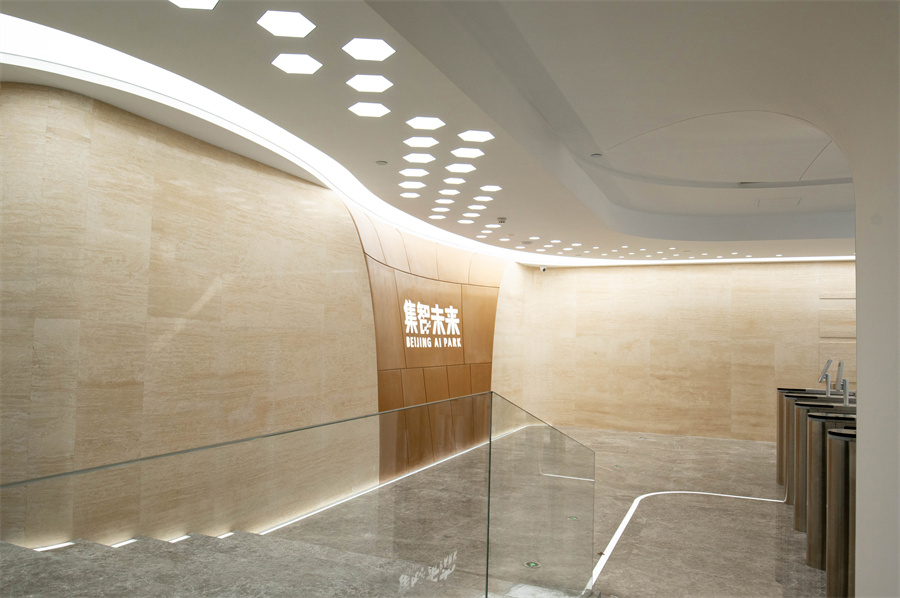
室内的主题弧形墙设计 ©刘敏玲
![]()
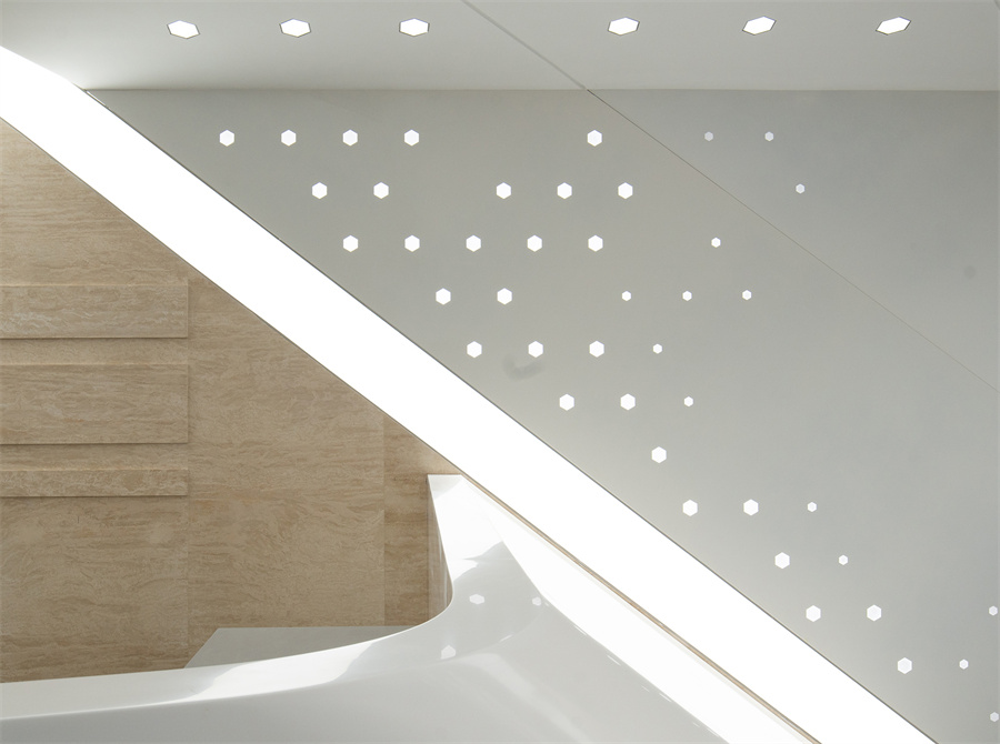
室内局部材质拼贴 ©刘敏玲
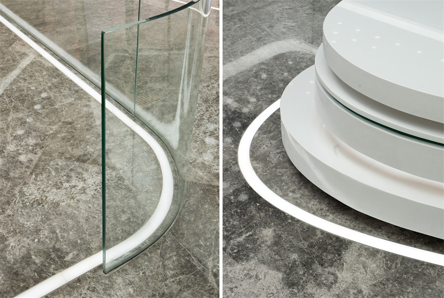
室内地面石材及灯带细节 ©刘敏玲
项目信息
项目名称 | 让旧建筑焕发新活力的科幻空间—北京大运村办公大厅改造
项目类型 | 办公、改造、室内
项目地点 | 北京市海淀区
设计单位 | 北京中天建中工程设计有限责任公司
项目详细地址 | 北京市海淀区大运村
项目完成年份 | 2022年4月
建筑面积(平方米) | 650㎡
项目参与者
项目负责人 | 丁明禄、甘力
设计团队 | 甘力、于兆雄、张烨、冯明飞、陈瑞霞、王国栋、于向东、马军、吴硕、何彪
其他参与者(例:合作方、业主、顾问团体等)| 北京天文弘建筑装饰集团有限公司(施工方)
摄影师 | 刘敏玲、中天建中、甲方(原貌照片)
其他参与者(例:合作方、业主、顾问团体等) | 业主身份保密